Case study · Osmosis Labs
Osmosis
The main exchange of the Cosmos ecosystem, used by two million people. I helped design its trading floor while the rules of on‑chain finance were still being written.
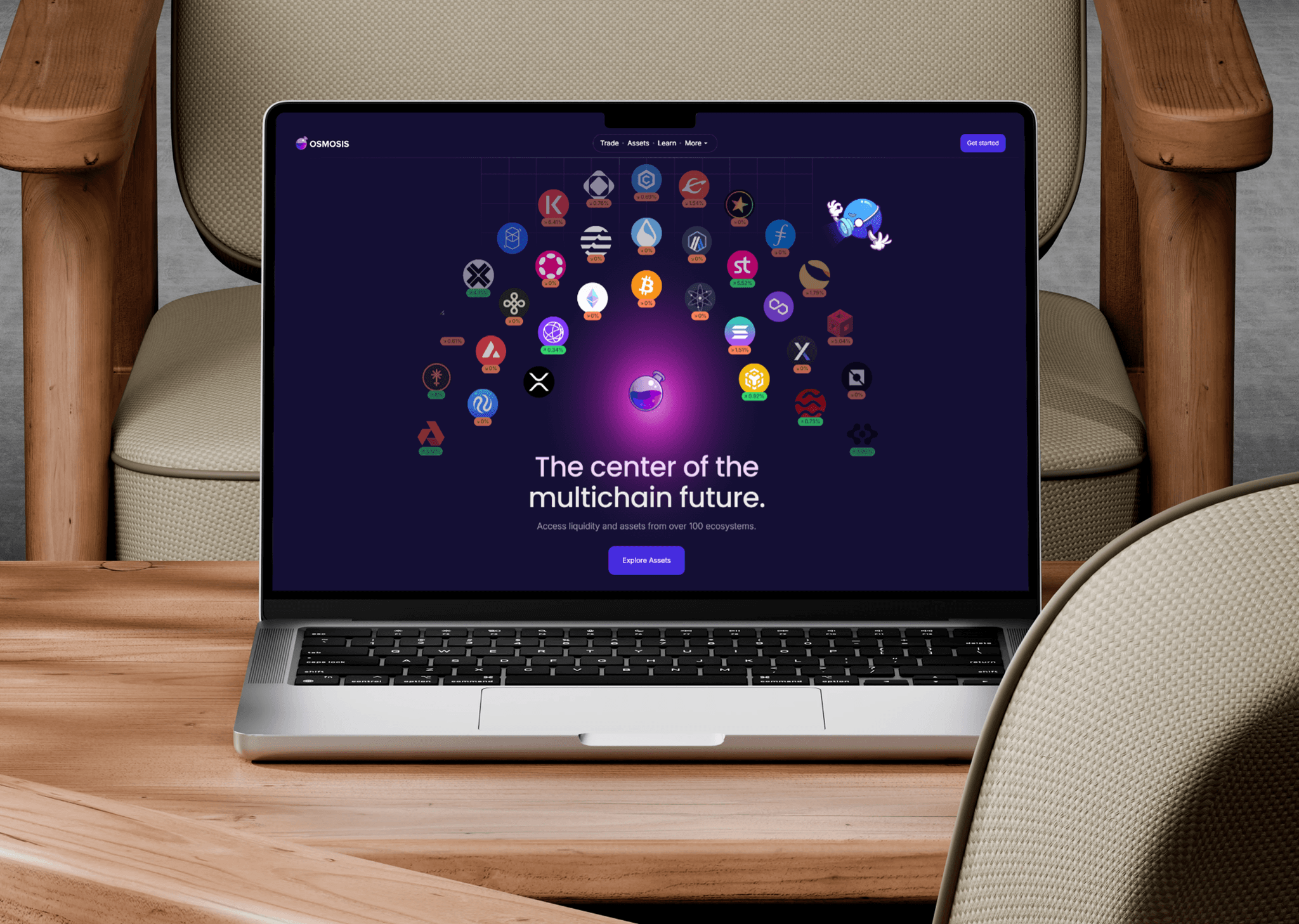
No playbook to copy
the fun part
When I joined, there was no settled way to design a decentralized exchange. Banking apps stand on decades of patterns. Crypto had a few years, most of them spent showing raw protocol mechanics straight to the user.
Osmosis runs as its own blockchain and moves assets between dozens of others. Most of the problems on my desk had never been solved by anyone, let alone written up. So the job was designing systems, not screens: how a swap explains a route that hops through three pools, what a transaction says while it waits on a chain, what failure even looks like when the network is the backend.
I was one of the first designers working on these problems. There was nothing to benchmark against, only traders, and what they told us.
Why it’s hard
Designing for crypto is designing for complexity.
- Every asset behaves differently
- Every chain has its own speed and quirks
- A swap can route through pools you never see
- Transactions fail, stall, or land at a different price
- Fees are paid in tokens that change by the minute
- Nothing can be undone
Every interaction carried dozens of states. The job was never to hide that system. It was to build an interface that could hold all of it and still feel calm.
Listening first
a lot of calls
Before touching a screen, we talked to the people trading on it: experienced DeFi traders, liquidity providers, cross-chain users inside Cosmos, and people arriving from centralized exchanges.
I logged every interview in Airtable and Notion, tagged so patterns surfaced across conversations instead of living in one person’s head. The same four things kept coming up:
- Trades took too many steps
- Market data was hard to scan
- Complexity with no structure
- Pros wanted speed

The trade screen
where it all happens
The trade screen is the heart of Osmosis. It is where people read the market and act, often with seconds to spare, so it had to be readable under pressure.
I redesigned it around one question: what does a trader need right now, and what is slowing them down? It brings together price analytics, live charts, route discovery for swaps, wallet balance awareness, and a clear preview before anything gets signed.
Everything they need, nothing in the way.

One-click trading
fewer pop-ups
Serious traders swap fast and often, and classic DeFi makes them approve every single step. One-click trading lets them trade straight from the interface.
The hard part was staying honest: faster should never mean blind, so the key details of what the system does on their behalf stay on screen the whole time.

Charts and pools
making money mechanics friendly
Traders live on visual signals. I designed charts and market indicators that surface price movement, trading activity and performance trends, and stay scannable when the market goes wild.
Liquidity pools are how Osmosis works at all: people supply assets and earn fees from trades. They are also genuinely confusing. The pool screens translate that into plain terms: how a pool is built, how your position changes over time, and how trading affects what you earn.
The hard part was never hiding the system. It was carrying its complexity without handing it to the user.lesson learned